
We're particularly proud of the new 2.8 version of Sandvox that we just released today. We've been working on the nuts and bolts behind it for a long time. There are many reasons to switch to this version of Sandvox, and over the next few days we'll cover some of the them in a little more depth here.
Reason #1: Retina-readiness!
We saw the need for Sandvox to support the capabilities of Retina displays shortly after the third-generation iPad was released in Spring 2012, followed by the Retina MacBook Pro in June.
While it was pretty easy to get the internal icons and graphics of Sandvox itself updated to include Retina-quality graphics, our bigger goal was to make the websites that Sandvox creates look sharp on Retina displays.
So, we started the process of updating Sandvox's internal handling of graphics to no longer be tied to the one-point-equals-one-pixel model.
There were a few challenges to overcome, which is why it took a while to make it happen. HTML itself isn't quite ready for Retina displays, so we had to come up with a solution that would carefully balance the needs of viewers on classic and Retina displays, different browser capabilities, and even search engines — all while keeping bandwidth demands for the images down.
We looked at a number of different approaches to providing Retina images, and settled on a lightweight solution that uses JavaScript to determine which kind of image should be served based on the viewer's screen resolution. (And, in the case of Javascript being disabled, a standard-resolution will be served.)
Along the way, we found that there were many cases in which we actually didn't want to provide both a regular and Retina-quality image. It turns out that one can get away with a much tighter image compression on the larger, double-resolution images; and doing so means that the high-resolution image is not that much bigger in file size (and transfer bandwidth) than the standard image.
By letting the browser scale down the image to fit, we get a great image no matter what the display. (Still, we use the two-image JavaScript technique for larger images and PNGs.)
We also found that we needed to upgrade some of our third-party libraries to look good. Our "photo gallery" and "slide show" displays, for instance, needed high-resolution controls.
That said, most of the changes were under the hood, so that all of Sandvox's image processing would be aware of the different image sizing. Before, a 300 x 200 image meant 300 pixels by 200 pixels. But factoring in retina display devices, Sandvox would need a 600 x 400 pixel image to fit in the 300 x 200 point area.
This paradigm shift had to be propagated throughout Sandvox — not just incorporated into the context of photos on a page, but thumbnail images, banners, and so forth. Plus, several plug-ins needed to be updated to deliver Retina graphics. Now, when you put a "Created with Sandvox" on your Sandvox website or link to Amazon.com products, visitors to your website will see the sharpest graphics possible on their display.
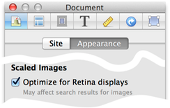
All of these features can be activated on existing Sandvox-built sites by checking the "Optimize for Retina Displays" checkbox in the Site inspector.
And the great thing is that you don't need to have a Retina display yourself to take advantage. Just mark the checkbox, publish your website, and any of your visitors who have a Retina (or any other kind of high-resolution) display will be able to see the sharper images.