Sandvox Designers Only

This is the design part of our Designer's Kit. This page has nothing to do with particular CSS or elements. It can be read by a web designer who is interested in mocking up a prototype of a Sandvox design, or it could be used as an introduction for a combination designer/coder.
Styles We Are Looking For
The sky is the limit! Styles can range from fancy and artistic such as those at CSS Zen Garden (subject to the technical constraints of a general website building program) to basic and simple like Wordpress themes.
Visual effects like gradients, subtle textures, shadows, and simulated glossy surfaces are nice elements to incorporate. Actual images, done tastefully, can enhance a design as well.
In practice, though, the simpler the design, the better, because it is more adaptable to a wider number of users.
Design Overview
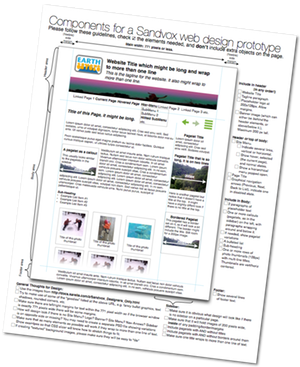
Please download this reference page. You can use it as a checklist for components of a Sandvox design. See below for details.
Main Sections of a Page
These are the elements that are required for a sandvox design. But almost all elements are optional for the user to include on their website. In other words, the design must look good with the optional elements present or absent.
Header
- optional Site Title text (Just a single, standard font; not a logo)
- optional Tagline text describing the site
- optional Logo Image
- optional Site Menu with a few links to other pages on the site
- optional Banner Image - this is usually a simple photograph or graphic, since it will probably be replaced with another image by the user.
Main Body
- optional Page Title (this could be visually integrated into the header area)
- optional Navigation Arrows (3 buttons: "Previous", "Next", and "Back to List") for moving around in the website
- optional Sidebar which contains "objects" (see below), or may be empty.
- a page's main contents will generally be one or more of:
- Text (with optional Subheader, with optional "objects" (see below).
- a Large Image (with a caption below)
- Thumbnail Grid (images and captions) to navigate among photos.
Objects are small areas of content (image, text, etc.) found in the sidebar or as part of the text content. A object optionally can have a Object Title.
Footer
The Footer is just an optional area at the bottom containing text.
Design Constraints
The designer has a lot of flexibility here but we do have some constraints and standards to keep in mind:
- Logo Size
- Maximum size is 200 pixels wide × 128 pixels tall. Here is an example (with transparency):
- Object Width
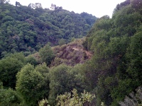
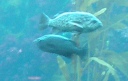
- A object's content area needs to fit images of 200 pixels wide or less. Consider margins around these images. Here is an example picture:
- Site Menu
- The design should accommodate at least 7 page titles in the site menu.
- There are three possible states for a site menu option: Not selected (a link to that page), selected (not a link), and selected section (with a link to the main page for that section.)
- Large Image
- up to 640 pixels wide (on a page with no sidebar) or 320 pixels wide (on a page with a sidebar).
- Thumbnail Grid
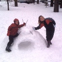
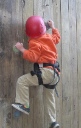
- Images are up to 128 pixels square. Depending on spacing, there will usually be room for 3 or 4 across on a page with a sidebar; on a page without, maybe 4 or 5 across. Here are 3 examples in square, portrait, and landscape aspect ratios.
- Color and Contrast
- Text should be of decent contrast and size; color palettes should be used that work with the color blind. You can use Vischeck to test colors.
- Page Width
- A design should be no wider than 771 pixels. (Yes, many screens are wider than 800 pixels these days, but it is better not to force a user to have their browser window set to fill the whole screen width. Thus, we prefer to have our designs work with smaller widths. This is also advantageous for devices like the iPad, which don't have a wide screen.) Of course a background image will make a design look good when the window is stretched wider.
Planning for Varying Content
The design may be created such that it varies depending on the presence of optional elements. Here are some examples:
- A page's header area could be very minimal if no banner has been set for a page, but if a banner is chosen, it might be taller to fit the banner.
- If a logo is set for a page, it could have a frame around it.
- If there is no site menu, then there could be a different border at the bottom of the header area so the design looks good when there is no site menu.
- The sidebar could have a decoration at the bottom, but only if the sidebar is not empty.
- A object with a Object Title might look different than one without.
- A page without a Sidebar might look different from a page with a sidebar
We also have a special distinction for Home Page. vs. other pages. Some designs might have a taller banner or larger site title but this is not common.
We also have the ability in the program to turn "bordered" attribute on objects. Please design for both options.
Building Variations
Many designers have been creating families of "variations" of a single design type. Usually everything is the same, except for the dominant color. Or, there may be a standard width design and a "wide" variation of the same design. Generally you would create a number of extra PhotoShop mockups after making the first prototype.
Design Flexibility
The designer has a number of choices:
- The Sidebar might go on the left or right
- A design might only show a banner if the user has set their own banner, and otherwise collapse the area reserved for a banner.
- The design might be 'stretching' to fit the browser window width, or a fixed width (see constraint below)
- The header information might actually go into the sidebar area if desired, as long as there is a different approach for pages without a sidebar.
- Site Menu might be arranged vertically or horizontally
- Objects in the sidebar might look distinctive from objects in the main body area
Optional opportunities for nice "goodies" to make your design really shine.
Please take advantage of these as much as possible. Let's be sure that "special effects" should not be intrusive or annoying.
- "Bullet" character that we can incorporate into <ul> elements.
- Graphical <hr> horizontal ruler (used to separate sections)
- Interesting graphical treatment for indented <blockquote> sections
- Underline graphics
- Varying graphics based on even/odd/numbered/first/last selectors in repeated elements. For instance, even/odd objects could vary their object title colors. Or the first and last items in the site menu could have a distinctive look. You could even make random-seeming variations by having different variations based on the numbered index in the list.
- Hover variations, so that links, the site menu, etc. changes its look when the mouse is hovered over it. (In a mockup, this would have to be annotated.)
- Use graphical elements and borders, such as tabs for the site menu, backgrounds around a title, etc.
- You could make use of some advanced browser capabilities but only if the design is OK when the browser doesn't support that. Here are some capabilities in the newest versions of Firefox and Safari that you could design for:
- text shadow
- text stroke (outline in a different color than it is filled)
- box shadow
- rounded corners (1 or more corners)
- image reflections
- image masks (e.g. blurred edges on a photo)
- image-based borders
- animation (webkit browsers only right now) in cases like hovering over links or photo grid thumbnails
- "Header Textual Images": Sandvox has the ability to render title elements as graphics, which allows us to use special fonts or effects (like reflection, shadow, glow) for headings. These don't render on older Internet Explorer versions, and the font has to either be one that is distributed with the Mac or that we can get the rights to redistribute. You can design for a special font, but there should be a fallback font to one of the standard Mac/Windows fonts in case that is not available. Note that because this is a difficult feature to implement, we are not encouraging its use for new designs.
Delivery Suggestions
Main Content Variations:
There are three kinds of main content in a page. These could be placed into three separate mockups, or they could just be stacked on the same page mockup:
- Text (with optional callout objects),
- Photo
- Photo Grid
Since our web pages are fairly flexible, it may be useful to present a few variations of the basic page design if the presence or absence of an element, or a variation in size, would impact the overall look of the page. Depending on your design, some of these may or may not be worth doing.
Some suggested variations that might be useful. This is only a suggestion.
- Home page vs. other page
- Sidebar vs. No Sidebar
- Banner vs. No Banner
- Site menu vs. No Site Menu
- Logo vs. No Logo
- Navigation Arrows vs. No Navigation Arrows
Additional Deliveries
- Thumbnail (required)
- A single thumbnail image representing your design. Not a miniaturized version of the page, but an image to indicate the essence (color and images, not text) of the design. Sandvox adds a rounded-rectangle border around this image, so do not include any border in your image. For thumbnails showing a pixel pattern from the design, the image can be its minimum size of 100 pixels wide by 65 pixels high. Most thumbnails should be double size (200 by 130) or even quadruple size (400 by 260) for a future version of Sandvox to display at a higher resolution ... but if the thumbnail image has pixel textures equivalent to the web page, it should not be scaled up. If your design comes with its own generic banner image (that can be redistributed with the design), it might be part of the thumbnail as well. You can use a multi-resolution TIFF if you want to make sure the thumbnail looks good in several sizes. Seven examples of different designs are shown below.
- Banner Image (Depends on Design)
- If your design requires a banner image, you should include a general-purpose, attractive image that complements the design.
- Placeholder Image (optional)
- It is often nice to have a sample image (640 pixels wide or 640 pixels tall) that works well as a "photo" page example, to match the graphical look or theme of the webpage.
Making Use of Third-Party Images
If you are distributing a design, it is your responsibility to make sure you have clearance for any content you use. You need to document the sources and permissions and include that in the deliverable.
Images used in designs you distribute need to be created by the designer, or need to be explicitly known to be OK for redistribution (since you are not just using the stock image, but are then distributing to others). This means no trademarked images (like company logos). For content by others, there a number of approaches:
- Images with an expired copyright, any images before 1923
- Stock photos from sites with appropriate restrictions. (Many stock photo sites are not appropriate; please be careful.)
- Images from government entities
Here are some stock photo sites with good potential:
- Stock Exchange
- Image * After
- PD Photo
- ShutterStock
- flickr
- Geek Philosopher
- For more possible sources, see Wikipedia:Public domain image resources
- A source of public domain vector art is Open Clip Art Library
Fonts
Fonts to use for standard text
- Feel free to specify Mac-specific and/or PC-specific fonts as first choice, in case the browser has those fonts installed. Please annotate the font names, and stick to standard fonts installed on Macs and/or PCs
- As a main fallback, specify a font that is found on both Macs and PCs:
- Arial
- Arial Black
- Comic Sans MS
- Courier New
- Georgia
- Helvetica
- Impact
- Times New Roman
- Times
- Trebuchet MS
- Verdana
Fonts for Header Textual Images
You can make use of the fonts that are already installed on OS X if you are planning for this technique. (We can conceivably get the rights to other fonts but that's more difficult; see below.)
Using @font-face Fonts
This more modern technique is great for embedding different fonts, and it's much simpler than the Header Textual Images. However, it is not recommended to use these for the fonts that Sandvox users are likely to be editing, e.g. the body text, because it is not currently easy or possible to activate a whole font family on the bold and italic variations of what is typed into Sandvox. Plus, fonts loaded only over the web are not shown in the font chooser within Sandvox. Therefore, it's a good idea to stick only to titles and generated text, where the user is not likely to want to change the font.
Font Sources
Fonts for Header Textual Images need to be redistributable if you (or Karelia) is to make your design available to others. Here are some potential sources of fonts; you will need to secure permission and possibly pay a licensing fee to the creator of the font if you are going to be distributing your design.
FontSquirrel has a good source of fonts that can be embedded with @font-face. Another option is to reference (and not include) fonts that are available online, such as those from the Google Fonts.
Keywords: designer, designers, guide, guides, guidance, quick, quickly, modify, modifying, modified, change, changing, custom, customize, customizing, customized, theme, themes, design, designs, color, colors, colour, colours, layout
