Updating an Existing Design for Sandvox 2
We have striven to keep Sandvox 1 designs compatible with Sandvox version 2.0 (and up). If you are seeing any issues not covered by this document, please get in touch with us. It might well be a bug in Sandvox 2, rather than your design; and if not, we should improve the documentation to cover the case.
We believe it is possible to have a design package that is compatible with both Sandvox 1 and Sandvox 2. You shouldn't be needing to make a separate "Sandvox 2" version of an existing design, but instead tweaking the existing bundle.
Please try to tackle this document in order; only the first section is essential; everything else is niceties on top, in decreasing importance.
In-Article Graphics
The biggest change in Sandvox 2 is that graphics can be placed almost anywhere within a page's article. What do we mean by that? Well, under Sandvox 1, you could embed an image in rich text areas, but nothing else. All other graphics (a graphic is anything that appears in Sandvox 2's "Objects" menu) were placed outside the article; they were either a callout, or in the sidebar.
Sandvox 2 ups the game. Graphics can now appear anywhere inside the article, including those placed as a callout. This can have several effects on your
Callouts can be located inside the article
Where before you had:
<div class="callout-container">
    ...
</div>
<div class="article">
    <p>...</p>
</div>
Sandvox 2 will instead generate:
<div class="article">
    <div class="callout-container">
        ...
    </div>
    <p>...</p>
</div>
We've found very, very few compatibility issues with this change, but keep your eyes peeled to see if callouts are not 100% as you expect under 2.0.
Clearing before a graphic
Callouts are expected to float to the left or right of a page so text can wrap around it. For neatness though, graphics other than small images & raw HTML expect to appear below the callout. So, this article:
<div class="callout-container">
    ...
</div>
<p>...</p>
<div class="large-graphic">
    ...
</div>
Is expected to layout like so:
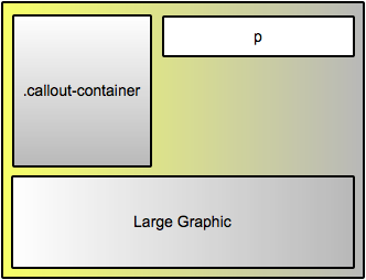
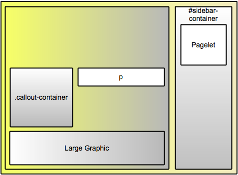
To achieve this, the large graphic needs a clear:left; rule applied to it. But many designs float their callouts to the right. Sandvox has no way of knowing which is the case up-front. So by default, Sandvox applies this to all graphics and callouts:
clear:both;
In theory this is ideal. Sandvox could allow callouts and images to be floated on either side of the page (we're only implementing this for images in 2.0 though; callouts remain on the design's preferred side).
However, some designs hit quite a snag: By clearing on the same side as the sidebar, graphics can end up cleared down to below the last sidebar pagelet:
Ideally, your design would be updated to avoid this. We find that making the main content area of the page floated achieves this well, and is what most of our built-in designs, and some third-party ones are already doing.
SVArticleGraphicsClearCSSValue
That might be an unacceptably big change to implement and test though. So instead, your design can instruct Sandvox to only clear on one side. Simply add the key SVArticleGraphicsClearCSSValue to your Info.plist, with a value of left or right.
Sandvox will then generate clears only on that side. Presently, this key affects the clear setting only, it will not restrict which side of the page users can place graphics on. We might use it in the future to infer which sides callouts are supported on, but 2.0 itself will not be doing this.
Indexes
Indexes are now regular graphics; they can be moved around the page as desired. This tends to have two effects on your designs:
Indexes can appear inside the article
<div class="article">
    <p>...</p>
    <div class="photo-grid">
        ...
    </div>
</div>
Practically, this makes it likely your indexes margins/padding are no longer correct, but shouldn't be too much trouble to correct.
Photo Grid
Since photo grids now tend to appear inside the article, styling not intended for the title of images in the grid may now be applied. In general we've noticed:
- The title of each image in the grid is a heading tag, thus rules such as
.article h3now come into effect, possibly:- Positioning the text slightly differently
- Applying an unwanted border or background
- Rules like
.article aalso come into effect, perhaps changing the appearance of the links undesirably
In our testing, we haven't come across any cases where this ruins the aesthetic of the site. Presumably, you'd like to issue an update that corrects the styling to be the same as under Sandvox 1, but this is at least non-critical.
To fix, it seems best to adapt whatever existing rules you have for styling the image titles so that they're more specific in the desired styling.
Indexes can be pagelets
If an index that generates heading tags is placed as a callout or in the sidebar, those headings will now be <H5>s. Your design may need an extra rule or two to style them nicely.
Page types are gone
Everything in Sandvox 2 is now an "object" or "graphic". For designs that were applying styling specific to, say, photo pages in 1.0, we've tried our best to maintain compatibility. Let us know if there's a problem you're seeing.
Image Scaling
Sandvox 1 used settings supplied in the Info.plist as the maximum size for an image.
Sandvox 2 continues to match this pretty closely. Those settings continue to be applied as the maximum an object can be normally be resized to by dragging the selection handles. Users are free to force a larger size if they wish by typing into the Metrics inspector. And of course, they can drag the image to make it smaller than the maximum as desired.
We try to use image scaling settings to set the initial size of an object, so that the user gets what they want out of the box. But if they're experimenting with different placements/designs, the object may be shrunk in the process, and they'll have to resize it back up again. All in all, settings from Sandvox 1 should continue to work great under 2.0.
Logo
Some third party Sandvox 1 designs were using CSS to size the logo. This is bad on two counts:
- Sandvox itself is unaware of the sizing, so publishes the logo image larger at a different size, leaving the browser to resize
- We want users to have control of the logo size; overriding their choice with CSS breaks that
Instead, please switch to the image sizing controls in the Info.plist as introduced by Sandvox 1.5.
Design Families
To avoid cluttering the Design Chooser too much, we'd like you to group variations of a design together.
Hierarchical Menus
If your customers would benefit from it, consider implementing Hierarchical Menus.
