

Now that we've given a little introduction to the magic behind Retina displays, and how Retina graphics differ from “regular” graphics, let’s get to work. What’s that, you ask? Well, we’re going to show you how Sandvox can now help you make a Retina-ready website right here.
You’ll need to have the latest Sandvox update (to version 2.8) installed in order to walk through this short, easy, step-by-step example scenario. It features a photographer’s small business website.
So, if you haven’t done it already — take a couple of minutes to download the latest update, and get it installed so you can explore these features and tools in Sandvox as you read this step-by-step guide to creating a website that is optimized for Retina displays.
Starting a New Retina-ready Website
Imagine you’re a freelance photographer and you want to showcase your work and advertise your services online with a website you plan to create using Sandvox. You fire up version 2.8 (or later) of Sandvox, and choose a design you like (have a look at Hydrogen and Kryptonite, the two new included designs added in this latest update).
As mentioned in the previous article introducing Retina displays and graphics, some elements that make up websites, like text, will be adjusted for viewing on Retina displays automatically by the system — but some cannot be — and that’s where Sandvox stands ready to assist.
When you use Sandvox version 2.8 or later to create a website, all you need to think about for Retina optimization are the images that you provide to Sandvox.
Getting Started: Two key things to keep in mind to ensure your website looks perfect on regular displays AND Retina displays:
- Use high-resolution images
- Check the Metrics Inspector
Step One: Make Sure Retina-optimization is ‘On’
New documents created in Sandvox 2.8 have this enabled by default. To check, go to the Appearance tab of the Document Inspector and look for the “Optimize for Retina displays” checkbox. When the box is checked, Sandvox automatically optimizes your website for Retina displays.
From this point, you can select a Retina-ready Design or add pages and features or text to your website as described in other Sandvox guides, tutorials, and materials.
Step Two: Adding Images
Add the high-resolution images you want to use on your website.
Tip: Starting with the 2.8 update, Sandvox now measures images in points, 1/72nd of an inch, rather than pixels. On “regular” resolution displays, one point (pt) equals one pixel (px). On Retina displays, one point equals two pixels. That means if you want a 500x500 point image to appear correctly on a Retina display, the source image you use needs to be at least 1000x1000 pixels. The easiest approach here is just to provide the highest fidelity image you have available. (If you have an image from a digital camera, it probably has plenty of resolution.) You don't need to worry about bandwidth since Sandvox will handle scaling it down appropriately.
Step Three: Check for Warnings
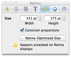
The Metrics Inspector is your friend when it comes to determining whether an image you are using is Retina-ready or not. It will show a warning if a selected image would appear pixelated on Retina displays. To resolve warning messages, just click the "Retina-Optimized Size" toggle button, which will reduce the physical of the image by half to make its resolution suitable for Retina displays and remove the warning. If you're not seeing a warning for any of the images you want optimized, you're all set. If you find that the image is smaller than you’d like it to be, perhaps you can find (or create) a higher resolution (more pixels!) version of the image, and replace the initial one with that.
Website Banners
Most of the built-in banners in Sandvox are Retina-ready. If you want to use a custom banner on your website, remember that you will need to check your graphic (whether it is a photograph, or any other kind of image) to make sure it is optimized.
Many people use custom banners to display graphics for their businesses like logos. If you are using a custom banner of your own, make sure that your banner is at least twice as large as the banner dimension specified for the design you are using. Roughly speaking, you want banner images to be at least 1600 pixels wide. You can refer to some helpful banner size information in Sandvox Help.
Image Management & Search Engines
Whenever possible, Sandvox will tightly compress the images you use on your website and upload a single, high-resolution image to your web host that will work for both kinds of displays.
In the case of large JPEG images and all PNG images, Sandvox creates two versions of the image and uploads both to the hosting server. The larger image, with more pixels, will be shown to visitors using Retina displays and the smaller image will be shown to visitors using regular displays.
Sandvox does this to manage bandwidth utilization in an efficient way for all of your website’s visitors. Keep in mind, however, that this second technique, like other Retina-optimization techniques, has an impact on search engine indexing. It prevents Google and other search engines from indexing those images.
Fortunately, there are multiple ways to make sure your images are indexed. Consider one or more of the following tips:
- Link images to full-size versions of themselves. If you do, search engines will find the links to the images and therefore the images themselves. To do so, select an image, go to the Link Inspector, and choose “Full-size Image” from the “Link To:” drop down menu.
- Use photo albums. Say you are building out a portfolio of images showing different styles of work you do. Group your photographs into albums by style. This ensures that small versions of the images get indexed.
- Use JPEG images that are no bigger than 1024x1024 pixels. For images of that size and type, Sandvox does not need to create two sizes of each image to support Retina displays.
Last Step: Publish Your Retina-ready Website
That's all there is to it. As you have learned, optimizing a Sandvox website with version 2.8 won't take much time or effort. Now, you can get started knowing that your site will look great on any display.
Optimizing an Existing Website
If you want to optimize a site you have already published, you can go about it two ways, once you have the latest version of Sandvox installed:
- Create a new site document, choose a Retina-ready Design and add your content following the steps above or
- Open your existing site document, turn Retina-optimization ‘on’, select a Retina-ready design and check each image or photograph you’ve added to your site with the Metrics inspector, resolving any warnings you find along the way. If you use a custom banner, follow the sizing tips earlier in the article.
Whether you’re starting from scratch or updating an existing site, it won’t take long to get Retina-ready and Sandvox will help make it simple!
Happy optimizing!