
One of the nice updates in the new Sandvox 1.5 is the seven new designs. This is a little tour of them.
Many people ask (OK, nobody asks, but maybe somebody is curious) where these design names come from. Really, it depends. Usually it's inspired by something in the design itself. Sometimes the designer him/herself will come up with something and it just sticks. Or, we'll pick an idea out of the air, or a song title, or a book….
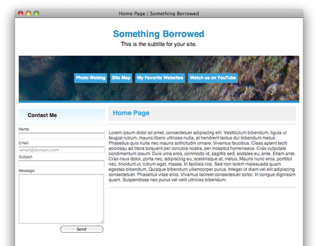
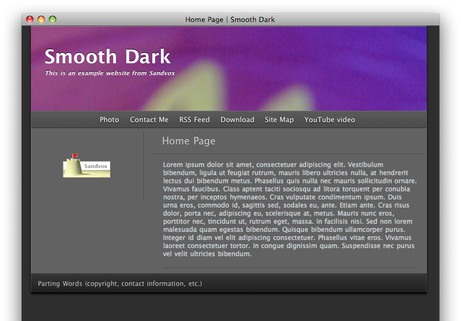
Without further ado, here are some thumbnails. Each of these screenshots have a custom banner element applied; you can add your own imagery to make the design truly yours.
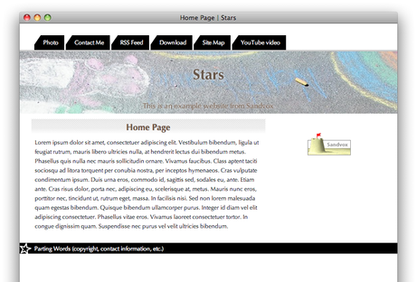
"Stars" is pretty obvious. We like the way that hovered items show a star over certain menu and title elements when you hover the mouse over them.
We have a lot of blue-themed designs, so how do you invoke the idea of blue but without saying blue?
Sometimes a literal name just fits. This design name reminds us of a fine liqueur or chocolate.
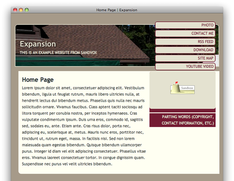
Another literal name; this is one of our few designs that stretches to fit the enclosing browser window.
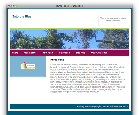
Here's a title inspired by a song title. Of course there are many artists with a song "Into the Blue" such as the Mission, Manual, Heaven 17, Moby, and so on. We'll let you decide which one fits this look. No, we haven't seen the Jessica Alba movie of the same name.
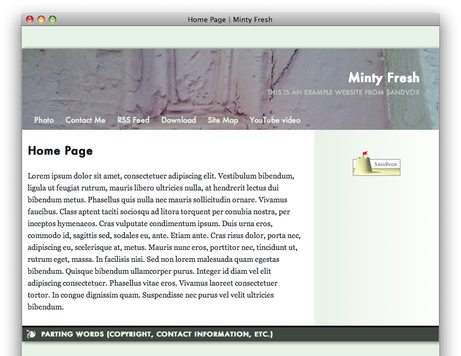
The "Minty Fresh" name started out with the mint-green color of the design. We got our inspiration from a character from a couple of Christopher Moore's books.
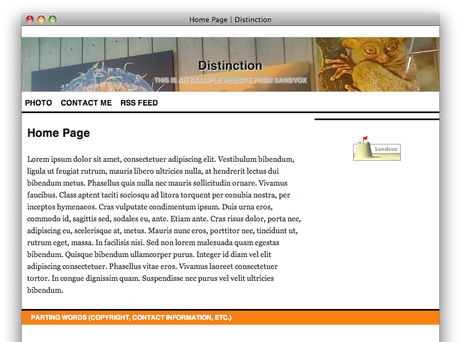
"Distinction" was a hard one to name. The bold orange swatch (reminiscent of some popular Wordpress blogs) is certainly distinctive. It may have helped that Dan recently re-discovered the band "Kitchens of Distinction," and may have been listening to one of their tracks recently.
This concludes our tour of the new designs in Sandvox. There are forty-three other designs in Sandvox 1.5 (many which have been revamped to allow for custom banners) so check them out!